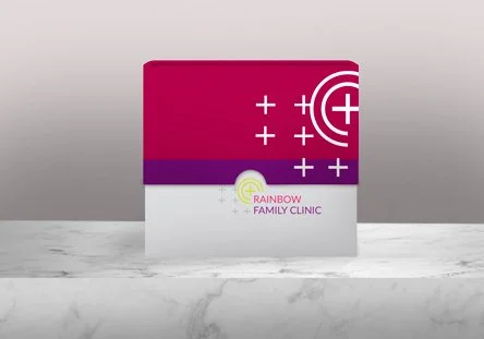
Logo: Rainbow Family Clinic
With the success of my previous work for Youth Arise, Sierra Leone, I was contacted by a LGBTQ clinic for young people that have been out on the street due to their sexual orientation. Rainbow Family Clinic gives support to their local community in the form of medical help as well as shelter.
They required a logo that matched the positive outlook they have and highlighted their focus on issues facing the youth. The logo needed to match:
Positivity
Optimism
Vibrancy
Youthfulness
Playfulness
Affection
Safety
In designing the set of optional logos pink and purple used first with a vibrant lime green. The traditional hospital cross is placed above the title and the crosses are repeated smaller to show that the clinic is a place for many people and a home of positivity. The lime green semi circles around the cross is repeating the shape of a rainbow in a way that is not too obvious and outdated.
The traditional cross in a circle is placed in front of a swirl of vibrant colours to show happiness. The edges of the cross are softened to seem friendlier and welcoming to the youth.
Chosen logo:
In another option green is used as the main colour. Crosses are used in the colours of the rainbow. The crosses form a barrier around the wording, implying that it is a safe place for people.


